

How to Write Better AI Image Prompts: Subject, Scene, Light, Lens, and Constraints
A practical framework for writing clearer AI image prompts using subject, scene, light, lens, constraints, iteration, and pre-publish checks.
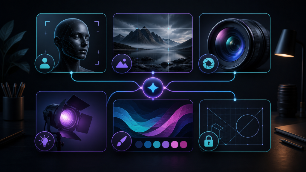
how to write AI image prompts is the central practical topic of this guide. The workflow below treats AI image production as a sequence of decisions—brief, generation, review, revision, and final-use checks—so quality depends on clear criteria rather than on accepting the first polished result.
how to write AI image prompts: practical decision criteria
Before choosing a model or writing a long prompt, define what must remain accurate, what may vary creatively, and how the final image will be judged. For business use, keep a short record of the source brief, references, model settings, major revisions, and final approval. This makes the process easier to repeat and easier to audit when an image is used in a campaign, publication, product page, or client deliverable.
Better AI image prompts are not necessarily longer prompts. They are prompts with a clearer visual hierarchy. When a generation goes wrong, the problem is often not a lack of adjectives; it is that the model was never told which parts of the image are structural, which parts are stylistic, and which parts are non-negotiable.
A practical way to improve consistency is to build every prompt from five layers: subject, scene, light, lens, and constraints. These layers map to decisions a photographer, illustrator, art director, or 3D artist would make before producing an image. They also give you a repeatable troubleshooting method: if the result feels wrong, you can identify which layer needs revision instead of rewriting everything.
1. Start with the subject, not the style
The subject is the visual anchor. Define what it is, what it is doing, and which physical details must remain recognizable. “A person in a room” leaves almost every decision open. “A fictional ceramic artist trimming a bowl at a workbench, sleeves rolled, hands near the clay, three-quarter profile” gives the model a clear action, pose, and relationship to the environment.
For products, subject definition should include geometry and material constraints. For architecture, it should include massing, openings, and the parts of the structure that must remain unchanged. For characters, it should include repeatable identity cues such as silhouette, hair shape, costume components, and proportions.
A useful subject block answers four questions: What is the main thing? What is it doing? Which features matter most? What must not change?
2. Build a scene that supports the subject
The scene gives the subject context. It includes location, time of day, weather, nearby objects, spatial depth, and production design. The mistake to avoid is treating the scene as a shopping list. If every background object receives equal emphasis, the model may distribute attention across the frame and weaken the main subject.
Instead, organize the scene by function. Choose one environment, one or two supporting details, and a depth cue. For example: “rain-soaked side street at night, warm storefront behind the subject, out-of-focus bicycle in the near foreground.” This describes place, atmosphere, and depth without competing with the subject.
For a clean advertising image, the scene may be intentionally minimal: black stone plinth, thin violet mist behind the product, dark seamless background. Minimal does not mean unspecified. It means every element has a job.
3. Treat lighting as physical, not emotional
Words such as dramatic, moody, beautiful, premium, or cinematic are useful as broad direction, but they do not explain where the light comes from. A stronger prompt names a source and direction: soft window light from camera left, warm practical lamp behind the subject, narrow cyan rim from the rear right, or overhead diffused studio key with a low-level front fill.
Motivated lighting is especially helpful in cinematic work. If the scene contains a storefront, desk lamp, neon sign, sunrise, or skylight, you can tell the model that this visible element is the dominant source. That creates a more coherent relationship between highlights, shadows, and atmosphere.
For reflective products, lighting instructions also control material perception. Glass needs edge definition and believable refraction. Brushed metal needs reflection shapes that match its roughness. Matte ceramic needs softer transitions. Describe the light and the material together rather than asking for a generic “luxury glow.”
4. Use the lens to control space and emphasis
The lens section does not need to imitate a particular camera system. Its purpose is to communicate field of view, perspective, camera distance, and depth behavior. A wider view can emphasize environment and spatial relationships. A longer lens can compress distance and isolate the subject. A close camera position can exaggerate perspective; a farther camera position can make geometry feel more controlled.
You can describe the camera in plain language: wide environmental shot, eye-level medium shot, close product detail, low-angle architecture view, overhead food composition. If focal length language is useful to you, add it as a secondary cue rather than expecting one number to solve the entire image.
Also state camera height and angle when perspective matters. “Eye level, straight-on, camera parallel to the product face” is much more useful for a catalog-like image than “professional photography.”
5. Add constraints after the creative direction
Constraints protect the output from common failures and from changes that would make the image unusable. They should be specific to the job. For a product: preserve geometry, no added labels, no duplicate components, realistic shadow contact. For an interior redesign: preserve walls, windows, door openings, camera position, and room proportions. For a character: preserve face shape, hair silhouette, costume colors, and body proportions.
Negative prompts or “no” lists can help, but a long list of generic defects can become noise. Prioritize the failures that would actually invalidate the image. If text is not needed, “no text, labels, logos, or watermarks” is useful. If hands are visible and important, include believable anatomy and natural finger count. If reflections are central, request physically coherent reflections and consistent light direction.
A reusable prompt anatomy
The following structure works across many image-generation systems because it is based on visual decisions rather than platform-specific syntax:
Subject: [WHO / WHAT], [ACTION / POSE], [NON-NEGOTIABLE FEATURES].
Scene: [LOCATION], [TIME], [WEATHER / ATMOSPHERE], [SUPPORTING DETAILS], [DEPTH CUE].
Composition: [SHOT SIZE], [SUBJECT POSITION], [NEGATIVE SPACE], [FOREGROUND / BACKGROUND RELATIONSHIP].
Camera / lens: [FIELD OF VIEW], [CAMERA HEIGHT], [ANGLE], [PERSPECTIVE], [DEPTH OF FIELD].
Lighting: [PRIMARY SOURCE + DIRECTION], [SECONDARY SOURCE], [FALLOFF], [HIGHLIGHT / SHADOW BEHAVIOR].
Materials and palette: [SURFACES], [TEXTURE], [COLOR PALETTE], [FINISH].
Constraints: [WHAT MUST STAY ACCURATE], [WHAT MUST NOT APPEAR], [PHYSICAL CONSISTENCY].
This is a framework, not a requirement to fill every field. A simple illustration may not need lens language. A product image may not need weather. Use only the decisions that materially affect the result.
Example: from vague to controlled
Consider the vague prompt: “Make a cinematic courier in a rainy city.” It sets a genre but leaves composition, action, camera, and light unresolved.
A controlled version might say: “Fictional bicycle courier standing under a narrow awning on a rain-soaked side street at night, checking a folded map. Medium-wide eye-level composition, subject on the left third, wet street leading into depth, 35mm-style environmental perspective. Teal practical light from a shop sign behind camera right, warm storefront glow in the background, realistic reflections on asphalt, light rain visible only where backlit. Dark navy, teal, and warm amber palette. Natural clothing materials, believable hands, coherent shadow direction, no text, logos, or duplicated bicycles.”
Notice that the improved version does not merely add more style words. It resolves production decisions.
How to iterate without losing control
When the first result is close, avoid rewriting the entire prompt. Change one layer at a time. If the scene is good but the image feels flat, adjust light. If the subject is too small, change composition and camera distance. If the product looks synthetic, improve material language. If the environment overwhelms the subject, remove background details rather than adding stronger adjectives.
A useful iteration sequence is: lock the subject; lock composition; correct lighting; correct materials; then refine palette and atmosphere. This prevents styling changes from hiding structural problems.
Decision criteria for different image types
- Cinematic scene: prioritize story beat, blocking, practical light, foreground depth, and color separation. Try the ready-to-use cinematic film still prompt.
- Product advertising: prioritize geometry, material response, reflections, shadow contact, and negative space. Use the luxury product hero shot prompt.
- Architecture: prioritize massing, camera position, perspective, openings, materials, and the boundary between creative visualization and factual representation.
- Character work: prioritize repeatable identifiers before emotion, pose, or costume variation.
- Editorial illustration: prioritize a single metaphor, strong hierarchy, palette, and a composition that leaves room for layout.
Common problems and how to fix them
The image looks generic
Replace abstract style adjectives with decisions: what is the subject doing, where is the camera, what is the dominant source, which materials are visible, and what is the palette?
The image is visually busy
Reduce the number of supporting objects. Protect one focal subject and one visual path through the frame. “More detail” is rarely the same as “more clarity.”
Lighting feels inconsistent
Name the dominant source and its direction. Then make secondary lights weaker and purposeful. If reflections disagree with the source, simplify the environment and request coherent reflection behavior.
The model changes the product or room
Move preservation requirements earlier and state them as non-negotiable constraints. For real commercial assets, compare the generated result against the reference before publication.
Text inside the image is unreliable
Reserve clean space and add final typography in a design or layout tool. This also gives you better control over accessibility, brand rules, and localization.
Limitations to remember
A well-structured prompt improves direction, but it does not guarantee factual accuracy or perfect physical consistency. Generated images can still contain subtle geometry errors, altered product details, impossible reflections, inconsistent text, or misleading visual implications. The more the image is used as evidence of a real object, place, product, or event, the more human verification matters.
Prompting also cannot replace proper reference management. If exact identity, architecture, packaging, or brand features matter, use authorized references and compare the output carefully. A beautiful image can still be wrong for the task.
Pre-publish checklist
- Is the intended subject immediately clear?
- Does the scene support rather than compete with the subject?
- Is the dominant light source understandable and physically plausible?
- Does the camera perspective match the goal?
- Are materials, edges, hands, reflections, and contact shadows believable?
- Are required product, character, or architectural features preserved?
- Is there accidental text, branding, or a misleading visual claim?
- Is the image appropriate for its commercial, editorial, or educational context?
- Have final typography and factual labels been added outside the generator when needed?
Bottom line
The most reliable image prompts behave like compact creative briefs. Define the subject, give it a scene, decide how the light works, choose a camera relationship, and protect the details that cannot change. Then iterate by layer instead of replacing the whole prompt. This approach makes results easier to diagnose, easier to repeat, and easier to adapt across cinematic scenes, product work, characters, interiors, social images, and illustration.