

Image Aspect Ratios for Cards, Covers and Full-Size Art
Compose for the final surface while preserving the original artwork.
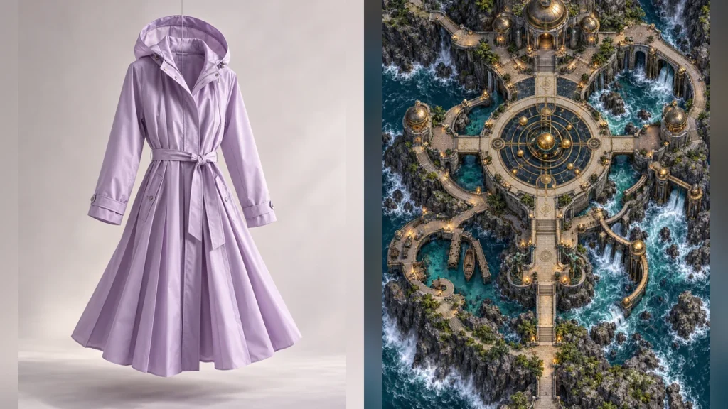
One image rarely fits every surface. A tall character portrait, square tactical map, and wide marketplace cover each need different composition. Cropping a finished image into all three can remove the subject or make detail too small.
Plan the main original
Create the artwork at the ratio that best serves it: tall for a full-body figure, square for a top-down map, and wide for an environmental panorama. Keep important details away from the edges. Export the high-resolution original and treat it as the source of truth.
Build previews deliberately
For a site card, use a consistent display box only if the complete subject still fits. A dedicated 4:5 composition may be better than cropping a square map into 4:5. Use object-fit: contain when preserving the entire original matters; if a card requires edge-to-edge fill, create a new composition with safe margins. Avoid black bars, thick frames, or stretching.
Test all surfaces
Inspect desktop, tablet, and mobile widths. Check whether card heights align, titles stay readable, and no important image detail disappears. Open the full-size original from the preview. For a collage cover, include the constituent originals too. The display should be consistent without pretending that every artwork has the same natural shape.