

Colored Light Is More Than a Fantasy Filter
Explore colored light through one original image, concrete design decisions and a practical review method.
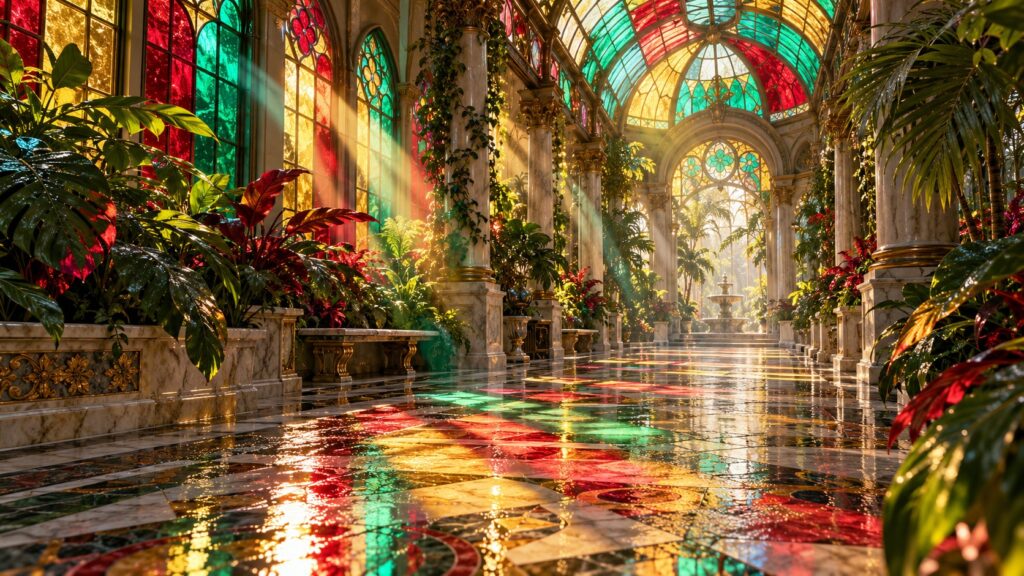
Colored light is easier to understand when we look beyond style names and describe what the viewer can actually read. Many fantasy images add rainbow color everywhere but never explain where the light comes from. This article uses one original scene as a concrete example and identifies the decisions that keep it coherent.
The visual problem
Many fantasy images add rainbow color everywhere but never explain where the light comes from. If the prompt only lists attractive objects, the model may render each object beautifully but fail to explain their relationship. The image then asks the audience to do extra work. A strong concept has a focal point, a scale relationship and a reason for the chosen camera position.
A practical principle for colored light
Treat each colored pane as a source with direction, distance and a surface it can illuminate. That instruction is more useful than stacking synonyms such as magical, stunning and cinematic. It tells the image system what must remain true when details change.
An example to inspect
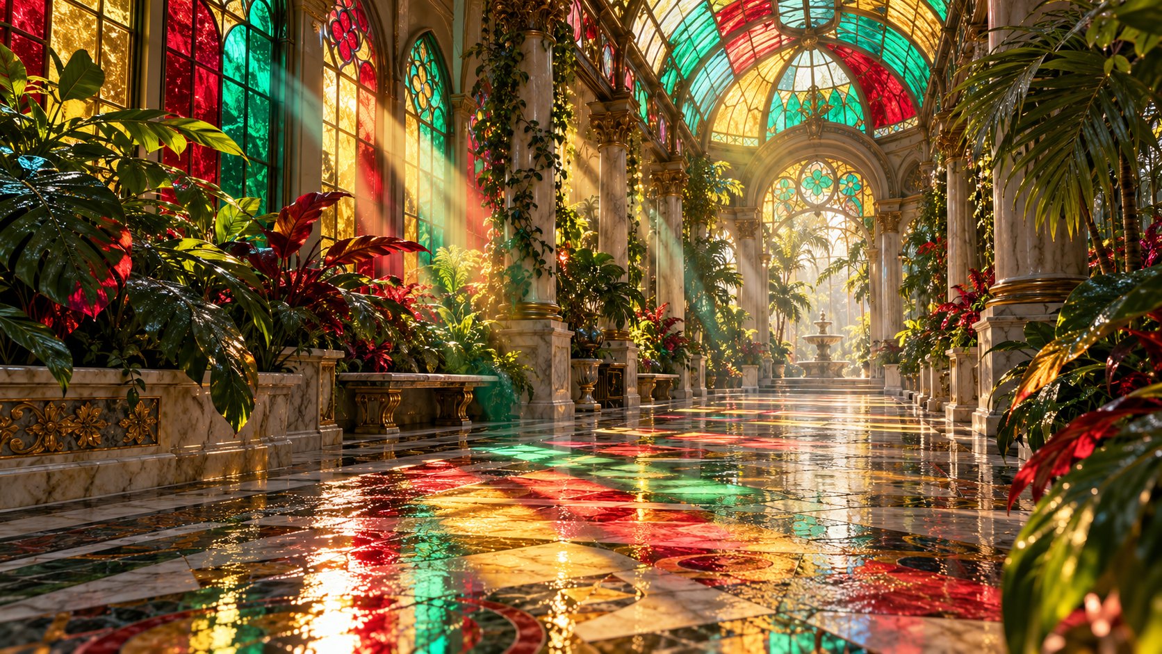
Ruby light can cross marble while blue light reaches a leaf edge; the dragon remains legible against both. Look at the image above as a draft, not a finished rulebook. Trace the path of the eye from the brightest area to the main subject and then toward supporting details. If an interesting detail interrupts that path, reduce its contrast or move it away from the edge of the frame.
Where the idea can fail
Too many colors at equal intensity compete with the character instead of supporting it. Another failure is treating every surface and light source alike. Separate the major materials, name the direction of light and reserve one quieter region. A viewer needs contrast in both color and information density.
Compare two directions before adding detail
For colored light, make one version with a wide camera and another that moves closer to the most meaningful action. Keep subject and lighting consistent. The comparison will show whether the design works because of the world or because of a single charming detail. If the close view tells the story better, the wide version may need a stronger silhouette. If the wide view wins, reduce small props rather than adding more. This kind of paired test is more informative than generating many unrelated candidates.
Colored light should behave like light, not a decorative overlay. It must originate at the windows, align with the sun and fall on surfaces consistently. Apply that observation to the next draft as one explicit instruction, then review the new frame at the same display size.
A repeatable review
- State the focal point in five words before generating.
- Check whether the setting supports or competes with that focal point.
- Compare outputs at their real display size, not only zoomed in.
- Change one constraint in the next prompt and record the effect.
- Keep the version whose composition remains clear after a crop.
This is a creative method, so the best result depends on the story you want the image to tell. Use the constraints as a foundation and keep room for surprising details that improve the scene rather than fighting its structure.
Try the copy-ready prompt, follow the companion guide, or browse more AI Craft Pad articles.
Frequently asked questions
How many details belong in the first prompt?
Enough to establish subject, setting, camera and light. Add micro-detail after the first composition works.
What if a colorful result is still hard to read?
Reduce competing focal points and check the silhouette at thumbnail size before changing the palette.
Final review for colored light
Review colored light at full size and as a small card. Trace each colored beam to its window and keep the dragon silhouette readable against the foliage. Compare the first result with a second version that changes only one camera or lighting choice.
Keep the strongest colored light version, then check perspective, material detail and the crop on a phone. For real-world visual reference, browse the Wikimedia Commons image library and verify the license of any image you reuse.