

Color and Shape Systems for Origami Characters
Origami character design: an original AI Craft Pad article with a colorful visual example and practical guidance.
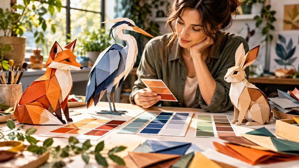
Color and shape starts with a clear subject, a readable silhouette and a strong visual decision. This original AI Craft Pad example gives you a direction to adapt, then a way to inspect and refine the result.
Origami character design becomes easier to judge when the visual decision is separated from surface polish. This article uses one original AI Craft Pad concept to show a practical design choice, its trade-off and a review method.
Start with the visual question
A family of characters needs shared construction rules and purposeful differences. Before opening an image or video generator, write the intended viewer response in one sentence. The sentence should describe what the audience can see, not simply a style label such as cinematic or premium.
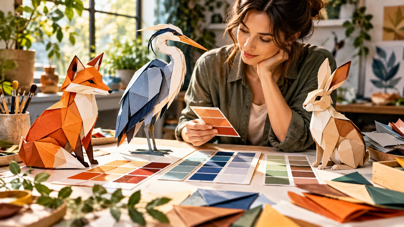
A fox, deer and hedgehog can share triangular fold language while ears, antlers and spines separate their silhouettes. The example works because one decision organizes the rest of the frame. Small details can support that decision, but they should not compete with it.
Build the scene in layers
First block the primary silhouette or information path. Next establish a scale cue and a believable light source. Only then add texture, decorative objects and finishing effects. This order makes a weak draft easier to diagnose: a beautiful texture cannot repair an unreadable composition.
For origami character design, the useful test is whether the core idea survives a thumbnail. Reduce the image to the size of a website card and ask what you notice first. If the answer is a background ornament rather than the intended subject, simplify the surrounding shapes or move the camera.
The common trade-off
Use a small palette system rather than assigning every character unrelated colors. A stronger result often comes from removing one attractive but distracting element. Keep a copy of the earlier version and change only one variable in the next pass; otherwise there is no clear evidence that the revision helped.
A repeatable review
Test each mascot as a tiny icon and as a full character sheet. Review the work at full size and at card size. Check anatomy, perspective, material behavior, wording and the final crop. If the piece makes a factual claim, verify it against an authoritative source before publication.
- State the intended viewer question in one sentence.
- Identify the one subject or path that must be understood first.
- Check the light source, scale cues and perspective.
- Compare a controlled alternate, changing only one variable.
- Inspect the final crop and any exact labels separately.
The illustrations in this article are original concept art. They demonstrate a design direction, not a guarantee that every model will repeat the same details. Explore related examples in the AI Craft Pad prompt library, and use Wikimedia Commons when you need licensed reference material.
Frequently asked questions
Should I change the style first?
Usually start with subject placement and reading order. A new style can make a weak layout feel fresh without solving the actual communication problem.
How many versions should I compare?
Two controlled versions are enough for a first decision. Keep the camera or composition fixed, change one named variable, and choose the version that explains the idea faster.
How to refine color and shape
Start with this scene brief: A designer comparing folded-paper fox, heron and rabbit silhouettes with palette swatches on a bright worktable. Keep the central subject easy to read at thumbnail size. Make one version with the original composition, then create a second version that changes only the camera angle or lighting. Compare how each version guides the eye. Retain the version with clearer depth, consistent materials and fewer distracting details.
For color and shape, check the image or opening frame at full size and on a phone. Look for unwanted lettering, malformed shapes, drifting identities and repeated objects. If one detail fails, fix that detail before changing the entire scene. Save the best result with its prompt, aspect ratio and generation settings so you can repeat the direction later. If you use outside source material, consult the Creative Commons licensing guide and verify the specific rights yourself.
A final check for Color and Shape Systems for Origami Characters: compare the result with its brief at full size and as a small card. Keep the version with the clearest subject, then record the setting or prompt change that improved it.