

Holiday Landing Page Design With AI: Mobile, Trust and CTA
Holiday landing page design for original holiday landing page projects. Five adaptable examples with production checks and practical next steps.
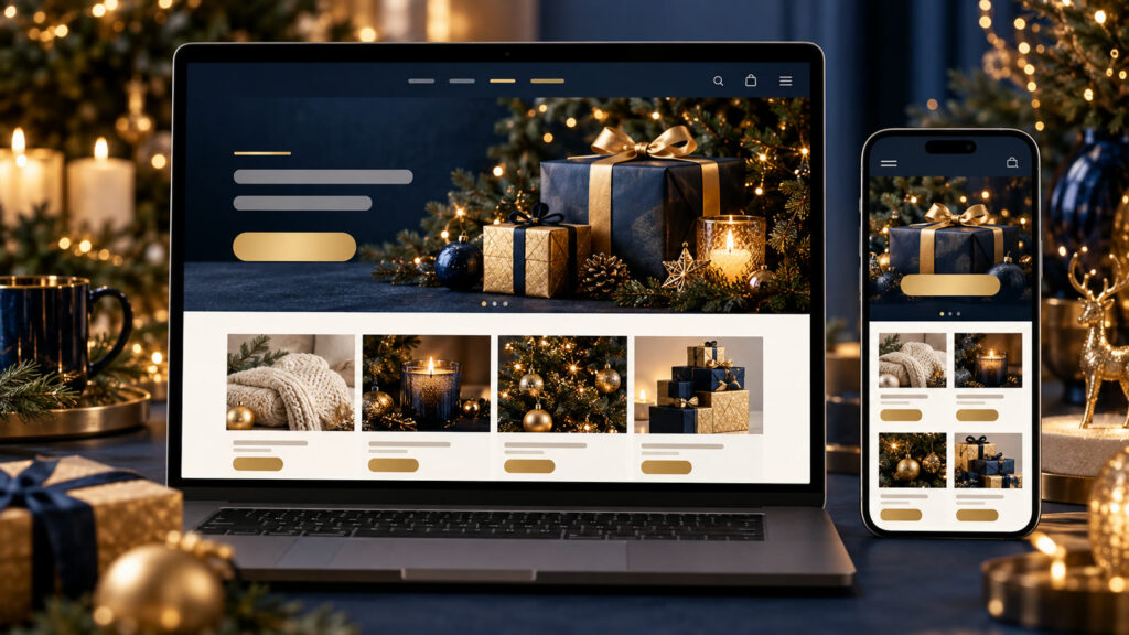
Holiday landing page design can turn a broad idea into a useful visual brief when the audience, output size, and success criteria are explicit. A seasonal landing page should help a visitor decide and act, not bury the offer under decoration. AI can help plan page structure, produce visual options and check gaps. The final page still needs accurate terms, accessible controls and a reliable mobile path.
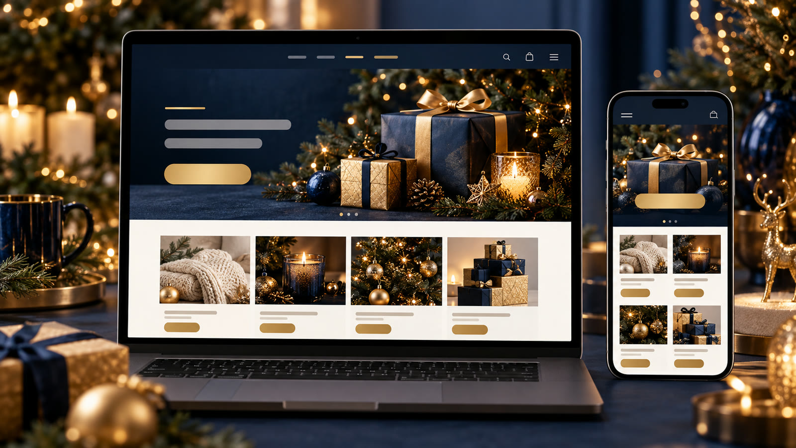
Build a clear holiday landing page brief
Write the offer in one sentence, then list the proof, conditions and the one action the visitor should take. Define the traffic source and mobile context. Ask AI for a wireframe with headline, evidence, product or service details, FAQ and CTA placement before requesting style. Keep real prices, delivery dates and stock in editable page content.
Before generating, decide where the result will appear. Specify the aspect ratio, how much space should remain for edited text, the intended audience, and any brand or personal details that must stay consistent. Keep typography outside the generated image when exact spelling matters. Save the source prompt and compare several outputs at the final viewing size.
Five Holiday landing page design to adapt
1. Small-store gift collection
Create a holiday landing-page wireframe for a small handmade gift shop. Begin with a clear collection promise, one real product photograph, price and delivery terms, then a short category grid and gift FAQ. Propose a desktop and mobile hierarchy, visible primary CTA and calm festive visual direction. Mark every fact that needs store-owner verification; no fake scarcity badge or reviews.
2. Local experience booking
Plan a winter experience landing page for a village workshop. Explain what guests will do, duration, accessibility, weather policy and how to book. Design a welcoming hero with real location photography and a mobile-first form. Include FAQ and trust details near the CTA. Do not invent opening hours, travel times or host credentials.
3. Business service seasonal offer
Sketch a holiday campaign page for a B2B design studio offering a limited onboarding session. Show value, deliverables, who it suits, proof and the exact request form fields. Use restrained seasonal accents, a professional tone and clear deadline only if supplied. Provide mobile and desktop wireframes without generating interface text as part of an image.
4. Charity giving page
Design a holiday donation landing-page structure for a local nonprofit. Lead with the mission and a verified impact statement, show where donations go, explain payment security and include accessible donation choices. Use dignified real imagery. Flag numbers or beneficiary stories lacking permission; avoid emotional manipulation or invented endorsements.
5. Email-to-page consistency audit
Compare a holiday email campaign brief with its landing-page outline. Check that headline, product, price, deadline and CTA match. List conflicts and missing information before suggesting layout improvements. Then propose a concise mobile page order and a simple tracking plan that does not obstruct consent or accessibility.
How to refine Holiday landing page design
Run the draft through a real phone-width preview. Move the primary action close to the value statement, but keep conditions visible before commitment. Test forms, confirmation text and error messages. If using AI visuals, verify that they match actual products, locations and services; a beautiful image cannot replace proof.
For a second pass, change one variable at a time: lighting, camera angle, color range, character gesture, or layout. This makes comparisons meaningful. If the image will support an offer, add the real copy and logo in a layout editor after the visual is approved. Never let a model invent product claims, prices, dates, or customer testimonials.
Quality and publishing checklist
Check performance, keyboard navigation, contrast, focus indicators, form labels and alt text. Read the page with images off: the offer and next action should still make sense. Verify current inventory, dates and returns policy. Compare the final page with the source campaign so people are not surprised after clicking.
Inspect the output at the dimensions used on the final page or device. Look for inconsistent anatomy, repeated objects, broken perspective, unreadable small details, and a focal point hidden by the crop. Write descriptive alt text for informative web images; the W3C image tutorial offers a useful decision guide. Explore the prompt catalog and more practical articles for related workflows.
Frequently asked questions
Should I start with a visual mockup?
Start with the offer and page structure, then use a mockup to test hierarchy and style.
How many CTAs should a holiday page have?
Use one primary action repeated where it helps, with any secondary action clearly less prominent.