

Christmas Website Hero Design With AI: Layout and Copy Space
Christmas website hero design ideas for stores, services and charities, with five AI visual briefs and practical layout and accessibility checks.
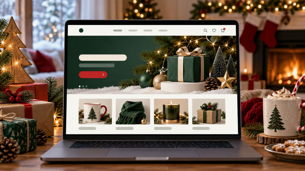
Christmas website hero design can turn a broad idea into a useful visual brief when the audience, output size, and success criteria are explicit. A holiday hero needs to explain the offer quickly while still feeling seasonal. The useful AI output is a visual direction with room for real HTML copy, buttons and product images. These examples cover a store, a service business, a charity, an editorial page and a mobile-first landing page.
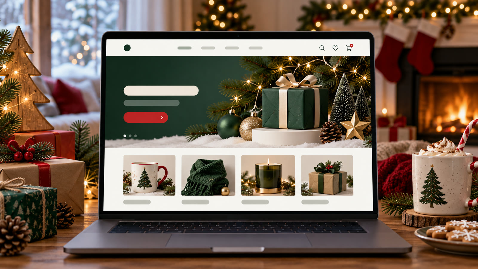
Build a clear Christmas website hero brief
Define the headline length, call-to-action position, desktop and mobile crops, and the product or service that deserves visual priority. Set contrast targets before decoration. Ask the image generator for background imagery without baked-in interface text, then build the actual page with accessible HTML. Keep sales terms and dates in editable content.
Before generating, decide where the result will appear. Specify the aspect ratio, how much space should remain for edited text, the intended audience, and any brand or personal details that must stay consistent. Keep typography outside the generated image when exact spelling matters. Save the source prompt and compare several outputs at the final viewing size.
Five Christmas website hero design to adapt
1. Gift store desktop hero
Design a wide Christmas ecommerce hero background for a small gift shop. Show three unbranded artisan products on a softly lit shelf with evergreens and paper stars. Leave a calm dark area on the left for a two-line headline and one primary button added in HTML. Strong contrast, warm but restrained palette, believable product scale, no generated words or invented discount badge.
2. Local service greeting
Create a Christmas website hero concept for a neighborhood home-services company. Show a welcoming winter home with warm window light and a clear walkway, not a generic party scene. Wide crop, uncluttered right side for a short service promise and booking button. Trustworthy photography, no people implying testimonials, no text or fabricated review stars.
3. Charity giving page
Make a respectful Christmas donation landing-page hero featuring volunteers packing winter supplies in a real-looking community space. Center human dignity and practical activity rather than staged sadness. Provide negative space for an editable headline, donation CTA and transparent impact statement. No invented beneficiary quotes or numbers, no letters in the image.
4. Editorial seasonal feature
Develop a Christmas editorial hero for an article about winter village crafts. Show handmade paper ornaments, wood tools and pine greenery in a documentary style. Crop safely for desktop and mobile, with a quiet upper area for article title overlay. Avoid stock-like gift piles, fake shop labels and hard-to-read decorative text.
5. Mobile-first campaign
Design a narrow Christmas mobile hero background for a limited seasonal collection. One clear product, warm window light, minimal evergreen accent and a calm top half for HTML heading and CTA. Keep product visible above the fold at phone size, avoid tiny objects or busy bokeh, and provide a matching wide crop with the same visual identity.
How to refine Christmas website hero design
Build the real hero in the site editor after choosing the visual. Set heading hierarchy, live offer copy and button labels there; then test keyboard navigation, contrast and image loading. Make a second mobile art direction if a desktop crop cuts off the product. A good hero should remain understandable when the image fails to load.
For a second pass, change one variable at a time: lighting, camera angle, color range, character gesture, or layout. This makes comparisons meaningful. If the image will support an offer, add the real copy and logo in a layout editor after the visual is approved. Never let a model invent product claims, prices, dates, or customer testimonials.
Quality and publishing checklist
Preview at common laptop and phone widths. Confirm that text never overlaps faces or critical product details, that the main button is obvious, and that seasonal visual effects do not slow the first paint. Supply alt text only when the image conveys information; decorative backgrounds can be marked as decorative. Verify every offer against current store policy.
Inspect the output at the dimensions used on the final page or device. Look for inconsistent anatomy, repeated objects, broken perspective, unreadable small details, and a focal point hidden by the crop. Write descriptive alt text for informative web images; the W3C image tutorial offers a useful decision guide. Explore the prompt catalog and more practical articles for related workflows.
Frequently asked questions
Should AI draw the headline and button?
No. Keep words and controls as HTML so they are sharp, accessible and editable.
How much Christmas decoration is enough?
Use enough to establish the season while preserving the offer and main action as the clearest parts of the hero.